Introduction
Material UI is a dynamic React library because it provides numerous component infrastructures for responsive web design. One such essential component is the Button.
In this article, we will deeply explore the Material UI Button component, its variants, and the different ways it can be used in a React application.
Steps we'll cover:
- What is Material UI
- Getting Started with the Material UI Button component
- How to use Material UI Button Component in your React project
- Creating a Calculator UI with light and dark mode using React Material UI Button Component
What is Material UI
Material UI is a React component library that is open source and based on Google's Material Design. It includes a comprehensive set of UI tools to assist developers in building and maintaining React applications, as well as effectively importing components into various parts of their projects. More developers have incorporated Material UI into their projects over the years because it makes the web design process much easier and faster.
The categories of components that Material UI can provide you include Layout components, Navigation components, Input components, and Data Display components. The Button is enlisted among the Input components.
Install the Material UI library into your project as part of your package.json dependencies with the following command:
Use npm
npm install @mui/material @emotion/react @emotion/styled
Use yarn
npm install @mui/material @emotion/react @emotion/styled
Getting Started with the Material UI Button component
The Material UI Button component provides developers with the tools that are needed to allow users perform actions and make decisions with a single tap/click. Buttons represent actions that users can take.
They are typically placed throughout your user interface in forms, navigation bars, cards, modal popups e.t.c.
The Material UI Button component typically comes in three variants:
- Text Button(The default variant)
- Contained Button
- Outlined Button
Here’s an illustration of how you can apply these Material UI Button variants in your React application:
import * as React from 'react';
import Stack from '@mui/material/Stack';
import Button from '@mui/material/Button';

const BasicButtons = () => {
  return (
    <div>
        <Stack spacing={2} direction="row">
            <Button variant="text">Text</Button>
            <Button variant="contained">Contained</Button>
            <Button variant="outlined">Outlined</Button>
        </Stack>
    </div>
  );
}

export default BasicButtons;
Here’s what they look like:

Material UI Button Colors
You can use the color prop to apply a color to Material UI buttons from the theme palette.
<Button color="secondary">Secondary color theme</Button>
<Button variant="contained" color="success">
    Success color theme
</Button>
<Button variant="outlined" color="error">
    Error color theme
</Button>
Material UI Button Sizes
You can customize the size of Material UI buttons with the size prop:
import * as React from 'react';
import Box from '@mui/material/Box';
import Button from '@mui/material/Button';

const ButtonSizes = () => {
  return (
    <Box sx={{ '& button': { m: 1 } }}>
      <div>
        <Button size="small">Small Text Button</Button>
        <Button size="medium">Medium Text Button</Button>
        <Button size="large">Large Text Button</Button>
      </div>
      <div>
        <Button variant="outlined" size="small">
          Small Outlined Button
        </Button>
        <Button variant="outlined" size="medium">
          Medium Outlined Button
        </Button>
        <Button variant="outlined" size="large">
          Large Outlined Button
        </Button>
      </div>
      <div>
        <Button variant="contained" size="small">
          Small Contained Button
        </Button>
        <Button variant="contained" size="medium">
          Medium Contained Button
        </Button>
        <Button variant="contained" size="large">
          Large Contained Button
        </Button>
      </div>
    </Box>
  );
}

export default ButtonSizes
Here’s the result:

How to use Material UI Button Component in your React project
Text Button
Text buttons are typically used for less visible actions, such as those found in dialogs and cards. Text buttons in cards help to keep the focus on the card content.
Here’s a simple illustration of the Material UI Text Button
<Button>Primary</Button>
<Button disabled>Disabled Text</Button>
<Button href="#text-buttons">Link Button</Button>

This is the default state for the Material UI Button component so you do not necessarily have to define this particular variant prop when calling the Button component.
Contained Button
Contained Buttons are high-emphasis buttons that can be identified by their elevation and fill. They indicate the primary actions of your apps. To use a contained button, you need to set the variant contained when calling the Material UI Button component.
Here’s an example:
<Button variant="contained">Contained Button</Button>
<Button variant="contained" disabled>
    Disabled Contained Button
</Button>
<Button variant="contained" href="#contained-buttons">
    Link Contained Button
</Button>

Outlined Button
Outlined buttons are medium-emphasis buttons that contain actions that are crucial but not the primary action in your app. Additionally, outlined buttons can be used as a higher emphasis alternative to text buttons or a lower emphasis alternative to contained buttons.
You can use Outlined Material UI button by specifying the outlined prop when calling the Button component.
<Button variant="outlined">Primary Outlined Button</Button>
<Button variant="outlined" disabled>
    Disabled Outlined Button
</Button>
<Button variant="outlined" href="#outlined-buttons">
    Link Outlined Button
</Button>

IconButton
An Icon button is a button represented by an icon set to perform a particular action. Icon buttons are typically found in app bars and toolbars. Icons are also appropriate for toggle buttons that allow for the selection or deselection of a single option, such as adding or removing a star from an item.
To include an icon button in your React app, import and use the IconButton component. Then you can use whatever icon you want from Material UI.
Here’s a simple illustration:
import * as React from 'react';
import IconButton from '@mui/material/IconButton';
import Stack from '@mui/material/Stack';
import CameraIcon from '@mui/icons-material/Camera';
import DeleteIcon from '@mui/icons-material/Delete';
import CancelIcon from '@mui/icons-material/Cancel';
import AttachEmailIcon from '@mui/icons-material/AttachEmail';

const IconButtons = () => {
  return (
    <Stack direction="row" spacing={1}>
      <IconButton aria-label="camera">
        <CameraIcon />
      </IconButton>
      <IconButton aria-label="delete" disabled color="primary">
        <DeleteIcon />
      </IconButton>
      <IconButton color="secondary" aria-label="cancel">
        <CancelIcon />
      </IconButton>
      <IconButton color="primary" aria-label="attach email">
        <AttachEmailIcon />
      </IconButton>
    </Stack>
  );
}

export default IconButtons
Here’s the result:
Loading Button
Loading buttons are buttons that can display the loading status of actions in your React apps and disable interactions. To use the LoadingButton component, you have to first install the Material UI lab dependency with the following command:
npm i @mui/lab
Now, you can import the LoadingButton component from the Material UI lab dependency and use it in whatever manner you please. You can customize your LoadingButton components by adding a loading prop which shows that the button is loading in your app’s UI. You can also set a loadingIndicator prop as well.
Here’s a simple illustration of how to use the LoadingButton component in your React app:
import * as React from 'react';
import LoadingButton from '@mui/lab/LoadingButton';
import SaveIcon from '@mui/icons-material/Save';
import Stack from '@mui/material/Stack';

const LoadingButtons = () => {
  return (
    <Stack direction="row" spacing={2}>
      <LoadingButton loading variant="outlined">
        Submit
      </LoadingButton>
      <LoadingButton loading loadingIndicator="Loading…" variant="outlined">
        Fetch data
      </LoadingButton>
      <LoadingButton
        loading
        loadingPosition="start"
        startIcon={<SaveIcon />}
        variant="outlined"
      >
        Save
      </LoadingButton>
    </Stack>
  );
}

export default LoadingButtons;
Here’s the result:

Icon and Label Buttons
Since we are more likely to recognize logos than plain text, you might occasionally want to add icons to certain buttons to improve the user experience of the application. When the icon component is assigned to the startIcon or endIcon props, the icon is aligned to the label's left or right.
Here’s a simple illustration:
import * as React from 'react';
import Button from '@mui/material/Button';
import AddIcon from '@mui/icons-material/Add';
import DeleteIcon from '@mui/icons-material/Delete';
import Stack from '@mui/material/Stack';

 const IconLabelButtons = () => {
  return (
    <Stack direction="row" spacing={2}>
      <Button variant="outlined" startIcon={<AddIcon />}>
        Add
      </Button>
      <Button variant="contained" endIcon={<DeleteIcon />}>
        Remove
      </Button>
    </Stack>
  );
}
export default IconLabelButtons

Creating a Calculator UI with light and dark mode using React Material UI Button Component
Material UI Buttons can be used for a variety of purposes in your React application. You can use them to take actions, switch directories and execute specific commands in your app. We can showcase some of their uses and function in a Calculator UI with light and dark mode toggling features.
The app will have two components: The Navbar component The Main component
The Navbar Component
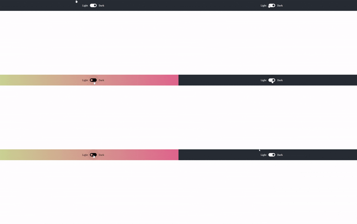
This component simply holds the light and dark mode toggler. To achieve this, we will make use of the ToggleOn and ToggleOff icon buttons.
Here’s the code for the Navbar component:
import React from "react";
import IconButton from '@mui/material/IconButton';
import ToggleOnIcon from '@mui/icons-material/ToggleOn';
import ToggleOffIcon from '@mui/icons-material/ToggleOff';

const Navbar = () => {
  return (
    <>
    <nav>
        <p>Light</p>
        <div>
          {darkMode ? (
                <IconButton >
                <ToggleOnIcon sx={{ fontSize: 50 }} onClick={handleToggle} className={darkMode ? "toggle-light" : "toggle-dark"} />
                </IconButton>
                ) : (

                <IconButton >
                <ToggleOffIcon sx={{ fontSize: 50 }} onClick={handleToggle} className={darkMode ? "toggle-light" : "toggle-dark"} />
                </IconButton>
             )}
        </div>
        <p>Dark</p>
    </nav>
    </>
  )
}

export default Navbar
The code above showcases the use of Material UI toggle buttons to create an adequate light and dark mode toggle theme.
Here’s the result:

The Main Component
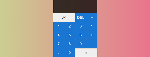
This component houses the Calculator’s grid system with all its buttons imported from Material UI.
Here’s the code:
import React from "react";
import Button from "@mui/material/Button";

const Main = () => {
 const buttonTexts = ['DEL', '÷', 1, 2, 3, '*', 4, 5, 6, '+', 7, 8, 9, '-', '.', 0,];

    return (
        <main>
            <div class="calculator-grid">
                <div class="output">
                    <div data-previous-operand class="previous-operand"></div>
                    <div data-current-operand class="current-operand"></div>
                </div>
                <Button class="span-two" variant="contained">
                    AC
                </Button>
                {buttonTexts.map((buttonText) => (
                    <Button variant="contained">{buttonText}</Button>
                ))}
                <Button variant="contained" class="span-two">
                    =
                </Button>
            </div>
        </main>
    );
};

export default Main;
Here’s the result:

You can toggle light and dark mode in the App.js like this:
import './App.css';
import React, { useState } from "react";
import Navbar from './Components/Navbar';
import Main from './Components/Main';

function App() {
  const [darkMode, setDarkMode] = useState("false");

  const handleToggle = () => {
    setDarkMode(prevDarkMode => !prevDarkMode);

}

  return (
    <div className={darkMode ? "dark": "App"}>
      <Navbar handleToggle={handleToggle} darkMode={darkMode} />
      <Main />
    </div>
  );
}

export default App;
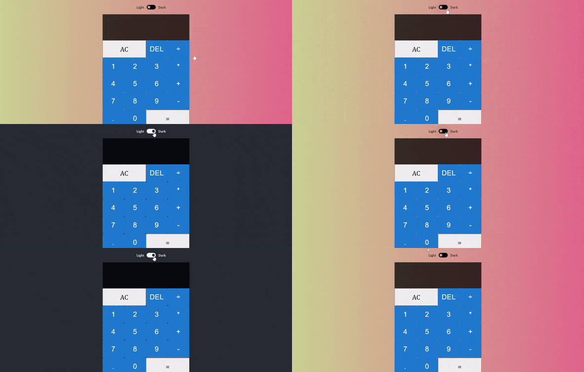
Here’s what our final app looks like:

Conclusion
This article covered Material UI Buttons and their applications in different areas of a React application. We also explored a possible use case in a calculator user interface with light and dark mode themes. You can access the source code on my GitHub Repo. You can also see the deployed application here.


